
Blog
The checkout questions that lose you the sale
Every extra field is a chance to reconsider. Which ones are worth keeping, which quietly cost you orders, and why the best checkout fix is usually deletion.
 Miki Sharkovski
4 min read
Updated August 28, 2026
Miki Sharkovski
4 min read
Updated August 28, 2026
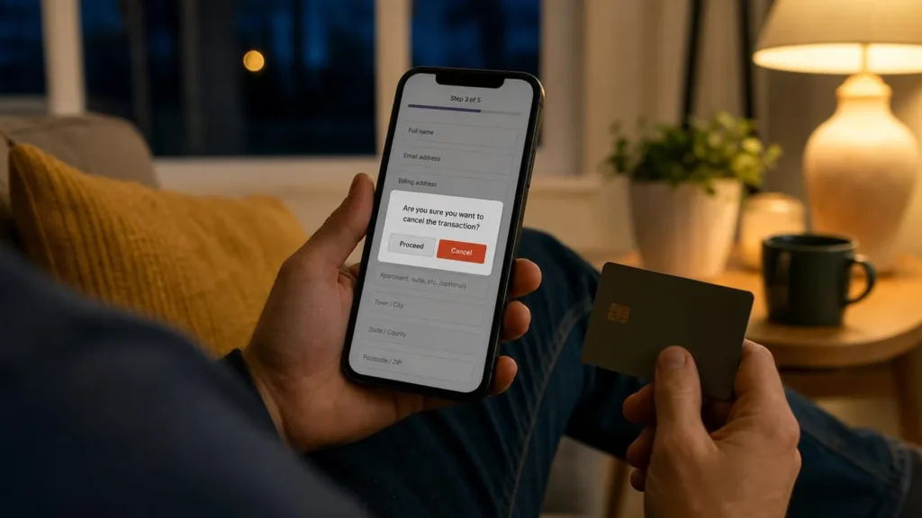
Checkout is the one place on a website where every extra element has a measurable cost. Everywhere else, an additional field or an extra step is a minor friction. At checkout it is a chance for someone holding a credit card to stop and reconsider.
Most checkouts are longer than they need to be, and almost none of the extra length was added for the customer’s benefit.
The test for every field
One question decides whether a field belongs: can we fulfill this order without it?
If yes, it does not belong in checkout. It might belong in an email afterwards, in an optional account area, or nowhere at all — but not between a customer and paying you.
Apply that test honestly and most checkouts lose a third of their fields.
The usual offenders
Company name, on a consumer store
Included by default in most e-commerce platforms. Irrelevant to the majority of buyers, and confusing enough that some people stop to wonder whether they are supposed to have one.
Address line 2
Worth keeping — some people genuinely need it — but it should never be required, and it should not be visually equal to line 1. Make it optional and let it recede.
Phone number
The most contested field. Delivery couriers often genuinely need it, so for physical goods there is a real case. For digital products there usually is not, and asking for one signals that somebody is going to call you.
If you need it, say why on the field: “for delivery updates only”. One line of text measurably reduces abandonment on this field.
“How did you hear about us?”
This is marketing’s field, not the customer’s. It asks someone mid-purchase to do unpaid market research. Ask it in the confirmation email, where a satisfied buyer will often happily answer.
Forced account creation
The single largest avoidable cause of checkout abandonment. Someone who wants one item is being asked to enter a relationship with your business, invent a password, and remember it.
Offer guest checkout. Then, on the confirmation page, offer to save their details — “create a password to track this order” — which converts far better because the purchase is already complete and the benefit is now obvious.
Coupon code boxes
A prominent empty coupon field tells every customer without a code that they are paying more than someone else. A predictable proportion will leave to go looking for one, and some will not come back.
Keep the functionality; hide it behind a small text link.
Things worth adding
Removing is not the only lever. A few additions consistently earn their place.
- Total cost, early. Unexpected shipping at the final step is the most cited reason for abandonment in survey after survey. Show it as soon as you can calculate it.
- Progress indication for anything longer than one page. Uncertainty about how much is left is its own friction.
- Recognizable payment logos. Not a trust badge from a company nobody has heard of — the actual card and wallet marks people recognize.
- The returns policy, in one sentence, near the button. Not a link to a policy page. The sentence.
- Inline validation. Tell someone their card number is wrong as they type it, not after they submit and lose their place.
Mobile is the real test
Most abandonment happens on phones, and most checkouts are designed on a desktop where the whole form is visible at once.
Three things matter disproportionately on mobile:
Correct input types. A numeric keyboard for card numbers and ZIP codes. An email keyboard for email. This is one attribute per field and it removes real irritation.
Autofill that works. Standard autocomplete attributes let the browser fill an entire address in one tap. Custom-built forms frequently break this without anyone noticing, because the developer tested on a machine with no saved addresses.
Wallets, offered first. Apple Pay and Google Pay skip the form entirely. For mobile buyers this is the single biggest improvement available, because the best checkout form is the one nobody has to fill in.
Test it the honest way
Buy something from your own store. On your phone. On cellular data, not office wifi. With a real card. Without using saved details.
Most people who do this for the first time find at least one thing they did not know was there.
The underlying point
Every field is a small ask, and the total ask has to stay smaller than the customer’s motivation. You cannot easily raise motivation at checkout — that work was done earlier, by the product and the pages that led here. What you can do is lower the ask.
Which means the best checkout optimization is usually deletion, and deletion is free.
Keep reading

What AI website builders are actually for
A prompt now produces a working website in a minute. What is genuinely in that output, what is…

When a social page is genuinely enough
Plenty of businesses are sold a website too early. When a social page is doing the job perfectly…

Who your website is unusable for
It works when you test it because you know where everything is. What actually breaks for everyone else,…