
Blog
Why your homepage is not the problem
Most businesses rebuild the page that is already working and ignore the three steps after it, where the money is actually leaking.
 Miki Sharkovski
5 min read
Updated August 28, 2026
Miki Sharkovski
5 min read
Updated August 28, 2026
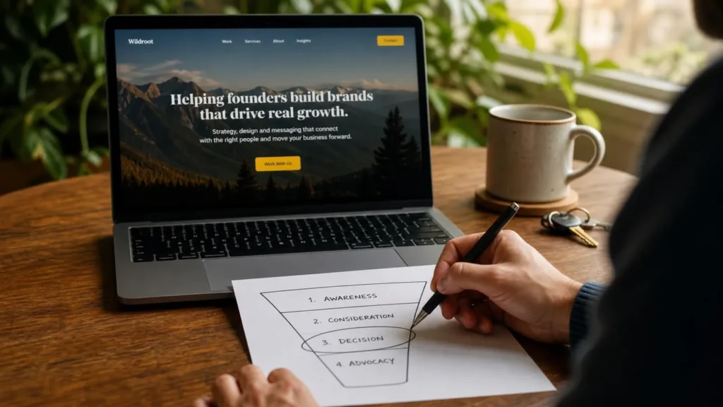
Almost every rebuild inquiry we get opens the same way: the homepage isn’t working. It looks dated, it doesn’t say the right thing, the competitor’s is nicer. Sometimes that’s true. Far more often the homepage is doing its job, and the money is leaking three steps further down.
Here’s the thing worth knowing before you spend anything: a website not getting inquiries is usually losing them further down. A homepage rarely closes a sale on its own. It qualifies. Someone lands, decides within a few seconds whether you’re plausibly the kind of business they’re looking for, and then goes looking for the specific thing they came for. The homepage’s whole job is to survive that first judgment and route people onward. Everything after that routing is where deals are actually won or lost.
Find out where people are actually leaving
Before touching a single pixel, open your analytics and look at two things.
First, your landing pages. If most people arrive somewhere other than the homepage — a service page, a blog post, a product — then the homepage is not your problem, because most visitors never see it. This is more common than people expect. Search sends people to the page that matches their query, not to your front door.
Second, look at where sessions end. Not bounce rate on the homepage, which mostly measures whether people found what they wanted immediately. Look at the last page in the session. That is where you are losing people.
Nine times out of ten, that page is a service page with no clear next step, or a contact form that asks too much.
The three steps that usually leak
1. The service page that never asks
Service pages are frequently written as descriptions. What we do, how long we’ve done it, a paragraph about our process. All perfectly true, and none of it asks the visitor to do anything.
Someone reading your service page has already qualified themselves. They arrived, they clicked through to the specific thing they need, and they read it. That is the warmest a stranger gets. If the page ends without a clear, low-friction next step, you have spent your best moment describing yourself.
The fix is usually one paragraph and one button, positioned where the reading naturally ends.
2. The form that asks like a mortgage application
Every field on a form is a small opportunity for someone to reconsider, and the same arithmetic applies at checkout. Phone number, company size, budget range, how did you hear about us, a dropdown of eleven service categories they don’t recognize the names of.
Each of those exists because someone internally wanted the data. None of them exist because the visitor wanted to give it.
Ask for the minimum that lets you have a useful first conversation. For most service businesses that’s a name, an email, and a sentence about what they need. You can ask everything else in the reply — by which point they’re a lead, not a stranger deciding whether you’re worth the effort.
3. The silence after
This one costs more than the other two combined and has nothing to do with the website.
Someone fills in your form on a Thursday evening. You reply Monday morning. In the intervening three days they contacted two competitors, one of whom replied within the hour and is now scoping their project.
Response time is a conversion factor. It’s also the cheapest one to fix, because it costs nothing but a decision.
When the homepage genuinely is the problem
To be fair to homepages, there are cases where it really is at fault:
- Nobody can tell what you do. If a stranger can’t answer “what does this business sell and who is it for” within about five seconds, nothing downstream matters.
- It’s slow enough that people leave before seeing it. A homepage that takes six seconds on a phone has a conversion problem no amount of copywriting fixes.
- It contradicts your actual business. The services listed are ones you stopped offering, the work shown isn’t the work you want more of.
- It’s genuinely embarrassing. Credibility is real. If your site makes people doubt you’re a going concern, that’s a business problem, not a design preference.
Notice that only one of those is about looks.
What to do first
In order, cheapest and highest-impact first:
- Cut the inquiry form. Reduce it to the fewest fields that still let you have a real conversation.
- Add one clear next step. Put it at the end of every service page.
- Set a response-time standard. Choose one you can actually hold to, and hold to it.
- Measure again after a month. Give the first three changes time to show.
- Then decide on the homepage. Only after that is a rebuild a question worth asking.
Steps one to three are usually a day’s work between you and whoever maintains your site. A rebuild is weeks and thousands. Doing them in that order sometimes means the rebuild turns out to be unnecessary — and where it doesn’t, at least you rebuild knowing what the site is actually failing at.
That’s the honest version of the advice, and it’s why we’ll sometimes talk a client out of the project they came in asking for. A rebuild that doesn’t earn back more than it costs is a bad trade, however good the result looks. If the budget is limited, a second off your load time is usually worth more than a redesign.
Keep reading

What AI website builders are actually for
A prompt now produces a working website in a minute. What is genuinely in that output, what is…

When a social page is genuinely enough
Plenty of businesses are sold a website too early. When a social page is doing the job perfectly…

Who your website is unusable for
It works when you test it because you know where everything is. What actually breaks for everyone else,…